
This fall, instead of looking to the changing colors of the leaves for style inspiration, we’re drawing ours from the changing colors of the Wisconsin sports scene! From Packers green and gold to Badgers red and white, we’ve got tons of trendy new ways to use some of Wisconsin’s most iconic color combos.

This fall, instead of looking to the changing colors of the leaves for style inspiration, we’re drawing ours from the changing colors of the Wisconsin sports scene! From Packers green and gold to Badgers red and white, we’ve got tons of trendy new ways to use some of Wisconsin’s most iconic color combos.
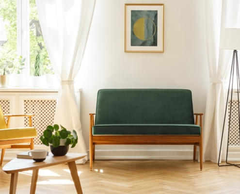
Gorgeous in Green
Green and gold: we couldn’t name a more iconic Wisconsin duo if we tried. Hailing from the city of Green Bay itself, this classic color combo has style that simply won’t quit—especially when applied in a modern way. Muted greens and matte yellows, for example, take this traditional combo and cast it in a more modern light. Our favorite way to incorporate these cheery shades is to bring actual greenery inside and highlight it with a yellow vase or knot pillow. Or, if you don’t have a green thumb, simply pair some fern-patterned wallpaper with a piece of gold pineapple wall art!
Pro-Tip: Go bold with a more traditional gold by using some gilded hardware to accent your already green interior!
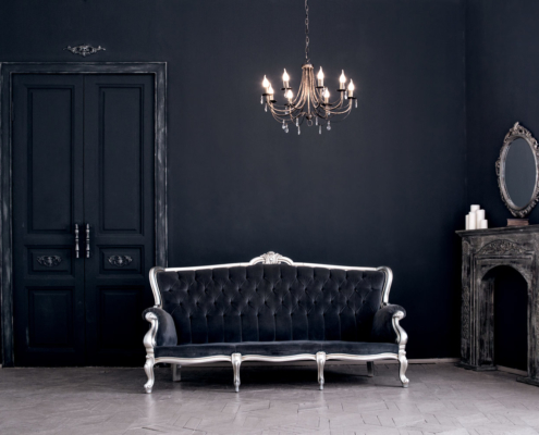
Pretty in Purple
Purple and green may be one of Wisconsin’s lesser-known color combos, but it’s certainly one of the most fashionable! Inspired by the Milwaukee Bucks in the late 90s, this unlikely partnership works well together in-part because the colors are complementary, meaning they provide a nice balance between warm and cool. Our favorite execution of this complementary color combination is a deep-purple velvet couch paired with a few green throw pillows and blankets. To add even more depth, grace your space with some purple drapes and let their natural style light up the room.
Pro-Tip: Give those colors a dramatic introduction into your space by laying down some stunning white tile underneath your feet! The stark contrast will create a stunning combo that’s equal parts dramatic and dazzling.
Beautiful in Blue
The Brewers know it best: when blue and gold come together, beautiful things can happen. Like green and purple, blue and gold are complementary colors that play off of each other perfectly. Blue carries with it a peaceful, calming feel while gold brings a luxurious, sophisticated aesthetic into the mix. You can bring it into your own space with the help from some glamorous gold shelving, gorgeous blue-velvet benches, or a colorful area rug! You won’t believe just how stellar this combo will make your space feel.
Better In Red
Out of every color combination, Badgers red and white just may be our favorite. Red itself has a very bold presence. It’s warm, inviting, and can instantly make any room feel energized. White, on the other hand, is a very neutral, calming color. It’s soft, easy on the eyes, and brings a sense of serenity into a space. That’s what makes this color combo so iconic; the white instantly smooths out the intensity of the red, making it much more palatable. So, if you start with spaces where the base color is already white, like a kitchen or bathroom, it only takes a few pops of red to spice things up. In your bathroom, simply hang up a few red towels and swap out your soap dispenser and dish for rosier models. In your kitchen, all it takes is a few red stools around your island or a red canister set to execute this combo with style.
Pro-Tip: If you’re a die-hard fan of the red and white combo, go all in with colored cabinetry! Make the base cabinets red, top them with white quartz counters, and then keep the upper cabinets white for the ultimate combo.
What Do You Think?
Which color combo are you a fan of?

If you like exclusive product discounts, sensible style trends, and easy-to-apply design tips, then you’ll love the Insiders List. Sign up below or click here to see what all the buzz is about.